A scatter chart shows points arranged on a grid.
Options
The scatter chart has up to six axes:
- x – position from left to right on the chart
- y – position from top to bottom on the chart
- label – name for the point
- size – size of the point
- color – color of the point
- tooltip – tooltip to show when hovering over the point.
The x and y axes are mandatory, the others are optional. Each axis has a single column, except for tooltip which may list multiple columns.
| Object | Property | Description |
| x axis, y axis |
column |
The column from which x axis or y axis values are to be read. x axis column defaults to 0, y axis column defaults to 1. |
| showLabel |
Set to true to false to turn off the axis label. |
|
| label |
label for the axis. If not present, the name from the column is used. |
|
| min | Standard usage | |
| max | Standard usage | |
| showTicks | Standard usage | |
| ticks |
Standard usage |
|
| showGridlines |
Standard usage |
|
| label | column |
Column from which point labels are to be read. Optional. If not present, no labels are produced. |
| size | column |
Column from which point sizes are to be read. Optional. If not present, a size of 1 is used, which gives a standard size point. The value in the size column is proportional to the area of the point. For example, a value four times higher will give a dot with double the diameter. |
| scale |
An amount by which values in the size column should be multiplied before calculating the size of the point. For example, if you wanted the value 10 to give a standard size point, set this to 0.1. |
|
| color | column |
Column from which point colors are to be read. Optional. If not present, a default color or standard colors are used. The colors can be translated using the standard options.colors object. This allows a data column, such as a status, to be used to color the points. |
| default | Default color to be used when there is no color column, or for rows that do not have a value for the color column. This will also be translated using the standard options.colors object. | |
| tooltip | column |
One or more columns that will be used to create tooltips. Optional. If not present, no tooltips are produced. If there is a single column, the value of the column will be shown in the tooltip. If there are multiple columns, a table of values will be shown in the tooltip. |
Examples
Consider a table which shows Sine and Cosine values for 10 degree intervals.
| Sine | Cosine |
| 0 | 1 |
| 0.174 | 0.985 |
| 0.342 | 0.940 |
| ... | ... |
| Default options assign a color to each point and plot them against each other. |
{
|
 |
| You can clean up the display by setting height, min and max, ticks, gridlines and color. |
{
|
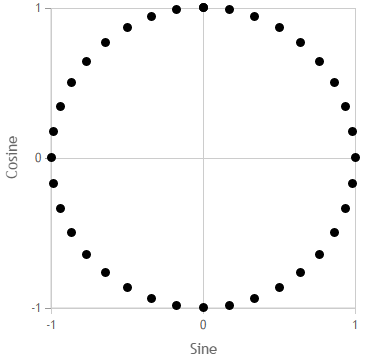 |
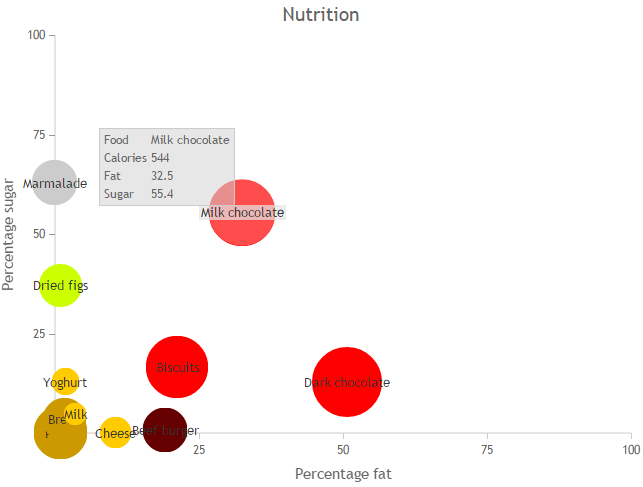
Consider a second table of nutritional information.
| Food | Calories | Fat | Sugar | Category | Notes |
| Cheese | 125 | 10.5 | 0 | dairy | |
| Milk | 64 | 3.6 | 4.7 | dairy | Whole milk |
| Yoghurt | 95 | 1.8 | 12.9 | dairy | Raspberry flavoured |
| Dried figs | 229 | 0.9 | 37.1 | fruit | |
| Beef burger | 249 | 19.1 | 0.7 | meat | Uncooked |
| Marmalade | 254 | 0 | 62.9 | ||
| Pasta | 359 | 1 | 0 | carbohydrate | Uncooked |
| Bread | 233 | 1.7 | 3.5 | carbohydrate | |
| Dark chocolate | 605 | 50.7 | 12.9 | sweet | |
| Milk chocolate | 544 | 32.5 | 55.4 | sweet | |
| Biscuits | 481 | 21.3 | 16.6 | sweet | Digestives |
The options below:
- Set a title.
- Set min, max, ticks and labels for the x and y axes.
- Set the size of the points according to the calories, so that 10 calories per 100g would be a standard point.
- Set the color of the points according to the category column. The colors object is used to translate between these categories and real colors.
- Show the food column as a title.
- Build a tooltip from the nutritional information.
{
  "type":"scatter",
  "showData":true,
  "title":"Nutrition",
  "showTitle":true,
  "axes":{
    "x":{
      "column":"fat",
      "min":0,
      "max":100,
      "ticks":[0,25,50,75,100],
      "label":"Percentage fat"
    },
    "y":{
      "column":"sugar",
      "min":0,
      "max":100,
      "ticks":[0,25,50,75,100],
      "label":"Percentage sugar"
    },
    "size":{
      "column":"calories",
      "scale":0.1
    },
    "color":{
      "column":"category",
      "default":"unknown"
    },
    "label":{
      "column":"food"
    },
    "tooltip":{
      "column":["food","calories","fat","sugar","notes"]
    }
  },
  "colors":{
    "meat":"#600",
    "dairy":"#FC0",
    "fruit":"#CF0",
    "carbohydrate":"#C90",
    "unknown":"#CCC",
    "sweet":"red"
  }
}