A pie chart shows a circle divided into different sized segments that represent different categories.
Options
The pie chart has three axes:
- "category" - identity of the different segments.
- "value" - value used to determine the angle of each segment.
- "color" - color of each segment.
Category defaults to column 0, value to column 1, and color is optional.
| Object | Property | Description |
| options | dataLabels |
Indicates what lable shouls be shown on the pie chart segments.
If dataLabels is anything other than category, a legend is shown which list the categories and the colors used to represent them. |
| category axis | column |
The column that holds the name of the categories. Defaults to 0. |
| value axis | column |
The column from which values are to be read. Defaults to 1. |
| color axis | column | The column that holds the colors for the segments. Default is to use standard colors. |
Styling
If you use dataLabels, the default jqplot rendering (grey) might get lost. You can change the color by setting CSS.
.jqplot-pie-series.jqplot-data-label {
  color: #FFFFFF;
}
Examples
Consider the following table, which analyses the consumption of different types of pie.
| Pie | Consumption | Color |
| Chicken | 14 | #CC6600 |
| Steak & Kidney | 21 | #660000 |
| Steak | 38 | #CC0000 |
This can be represented in JSON.
{
    "columns": [
        {
            "name": "Pie",
            "reference": "pie"
        },
        {
            "name": "Consumption",
            "reference": "consumption",
            "type":"number"
        },
        {
            "name": "Color",
            "reference": "color"
        }
    ],
    "rows": [
        {
            "pie": "Chicken",
            "consumption": 14,
            "color": "#CC6600"
        },
        {
            "pie": "Steak & Kidney",
            "consumption": 21,
            "color": "#660000"
        },
        {
            "pie": "Steak",
            "consumption": 38,
            "color": "#CC0000"
        }
    ]
}| Notes | Options | Chart |
|---|---|---|
|
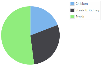
This demonstrates the default options. The segments are not labelled. Default colors are used. There is a legend connecting the segment colors with the categories. |
"options": {
|
 |
|
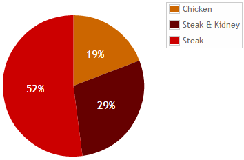
The third colum (i.e. column 2) is used for colors. Segments are labelled with percentages and the legend is shown. This option has also used the CSS above to color the data labels white. |
"options": {
|
 |
|
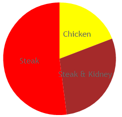
Colors are based on the categories, and translated into real colors using the options.colors lookup. Segments are labelled with the category. The legend is not shown because the categories are shown on the segments. |
"options": { "
|
 |