A line chart shows how a value of values vary across a series of other values, for example looking at sales by date.
Options
The bar chart has two axes, x and y, which have the standard mathemematical meanings.
The x axis column can repeat.
| Object | Property | Description |
| x axis | column |
The column from which x axis values are to be read. Defaults to 0. |
| showLabel |
Set to true to false to turn off the x-axis label. |
|
| label |
label for the x-axis. If not present, the name from the column is used. |
|
| min | Standard usage | |
| max | Standard usage | |
| showTicks | Standard usage | |
| ticks |
Standard usage |
|
| showGridlines |
Standard usage |
|
| x column | name |
Used as the x-axis label. |
| y axis | column |
The column or columns from which y axis values are to be read. Defaults to 1. |
| showLabel |
Set to true to show a label for the y axis. If there is a single y axis column, this defaults to true, and the label is either taken from the y axis label or the y axis column name. If there is more than one y axis column, this defaults to false, and if set to true the label is taken from the y axis label. However, a legend is shown to distinguish one line from another. |
|
| label |
If there are multiple value columns, the label to use for the values. If there is a single value column, the label is taken from the name of the value column. |
|
| min | Standard usage | |
| max | Standard usage | |
| showTicks | Standard usage | |
| ticks |
Standard usage |
|
| showGridlines |
Standard usage |
|
| y column | name |
Used as a data label. If there is a single y column, the label is shown as the label of the y axis. If there are multiple y columns, an additional legend is shown |
| color | Used to color the lines. |
Examples
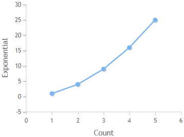
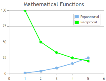
Consider a table which shows numbers, number squared (exponential), and 100/number (reciprocal).
| Number | Exponential | Reciprocal |
| 1 | 1 | 100 |
| 2 | 4 | 50 |
| 3 | 9 | 33.3 |
| 4 | 16 | 25 |
| 5 | 25 | 20 |
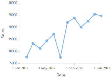
Consider a second table which shows monthly sales, as end-of-month date and sales. The date column has a type of "date".
| Date | Sales |
| 2012-01-31 | 7600 |
| 2012-02-28 | 13200 |
| 2012-03-31 | 11145 |
| 2012-04-30 | 14327 |
| 2012-05-31 | 17060 |
| 2012-06-30 | 7461 |
| 2012-07-31 | 21876 |
| 2012-08-31 | 23764 |
| 2012-09-30 | 19980 |
| 2012-10-31 | 22457 |
| 2012-11-30 | 25345 |
| 2012-12-31 | 24621 |
| Notes | Options | Chart |
|---|---|---|
|
This demonstrates the default options. Only one column is plotted on the y axis. Both axes are labelled. |
"options": {
 "type": "line"
}
|
 |
|
More than one column can be plotted by passing an array as the y axis column. The label has been switched off the x axis. No label is shown on the y axis because there is more than one column. However, a legend is shown to distinguish between the two lines. A min and max have been set for the y axis, and gridlines have been switched on. The color for the reciprocal line has been changed from the default to green. |
"options": {
|
 |
| Date can be used in the x axis. The column type must be date for this to work. |
"options": {
"type": "line"
|
 |